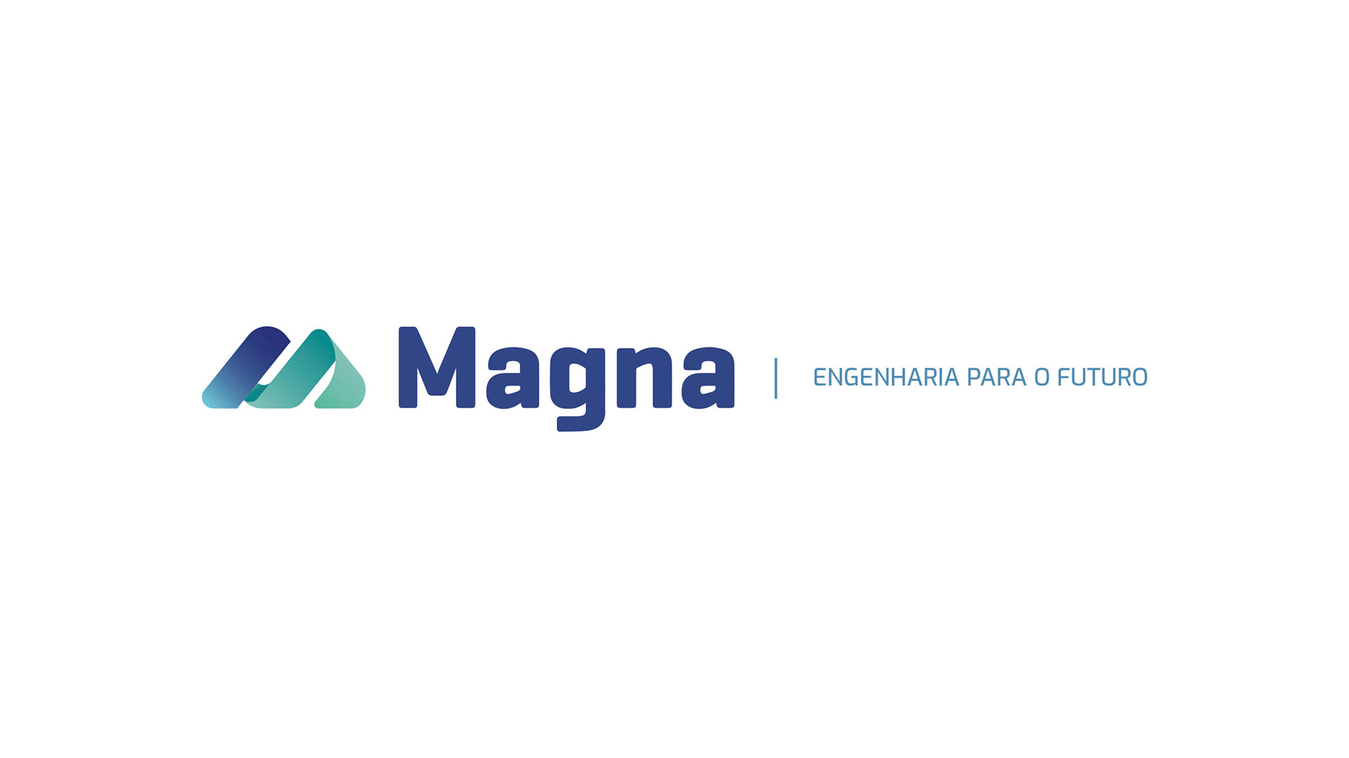
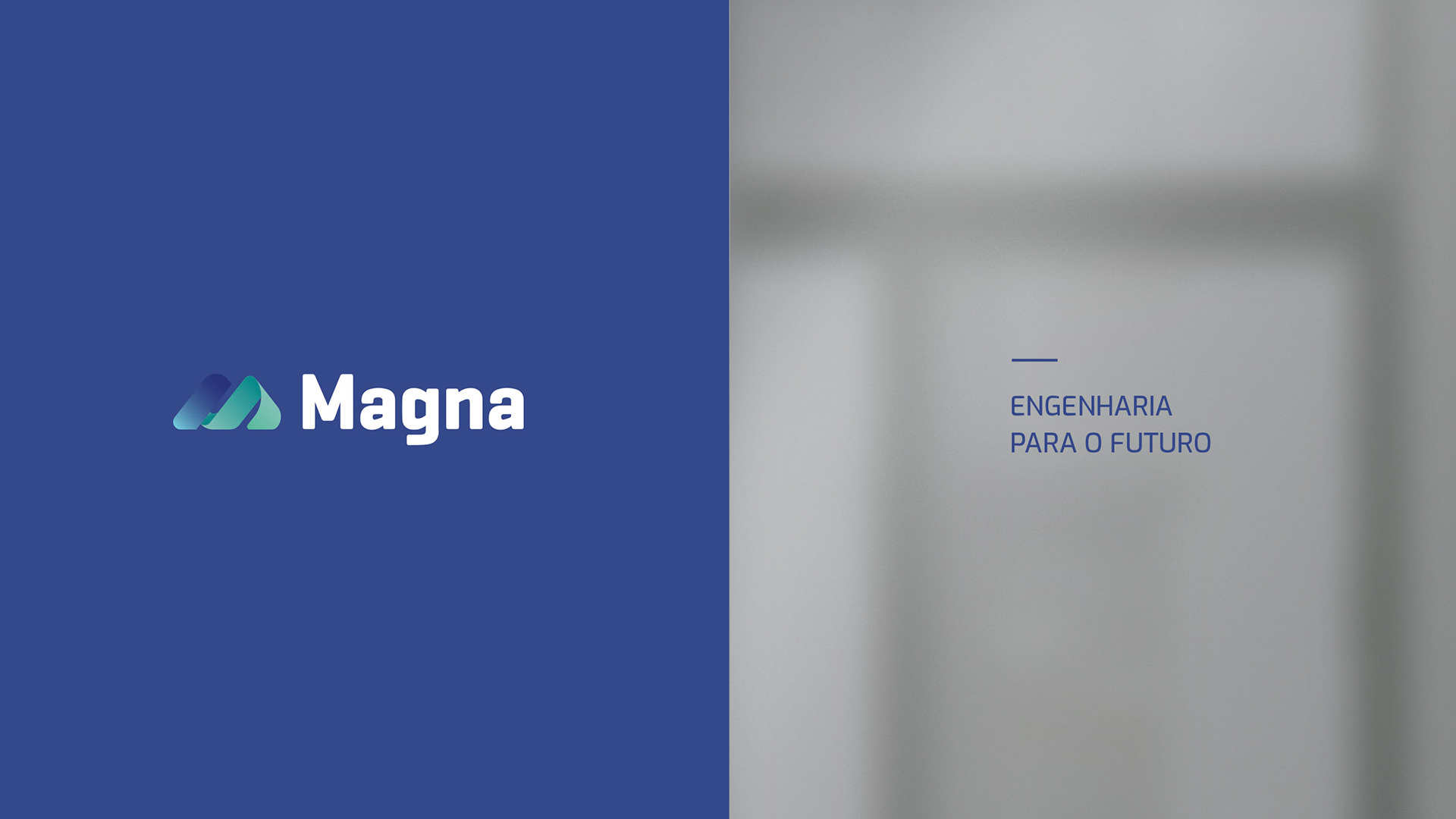
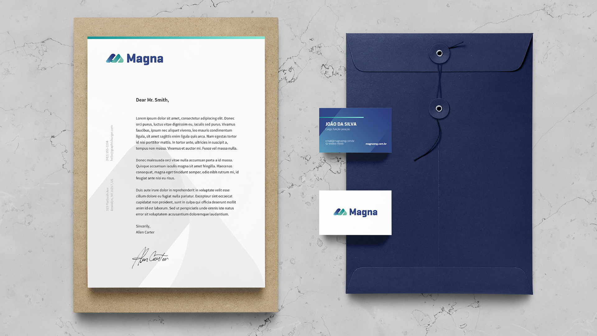
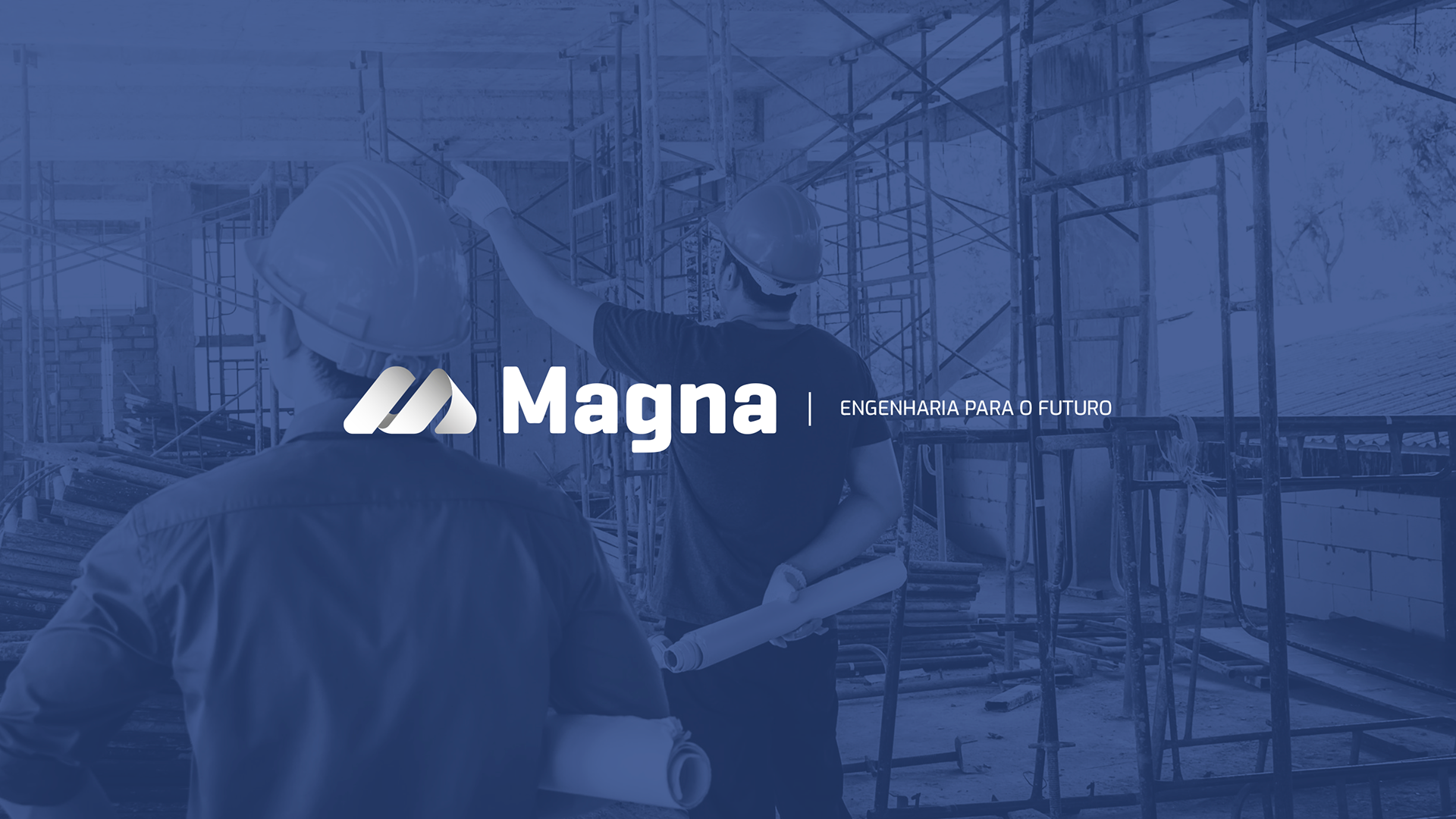
Magna has over 50 years of existence, and most companies linked to the engineering area recognize its authority in the subject. To reinforce this image and renew it, a symbol based on the letter "M" was developed. Now the visual identity comprises the freshness and thirst for innovation that is built into Magna's core, and the chosen tagline (Engineering for the future) clarifies the main purpose of the brand.


Identidade visual e direção de arte: Luiza Oliveira
Agência Órbita